5 Favorite Reports to Check Remotely for a Robotic Herd
Posted: March 30, 2020
With COVID-19 keeping us at home, here are some things you can look at to check progress on your Lely® farm with a robotic milking system. Here are my favorite reports to review (in no particular order).
Report 43P:
This report graphs each cow’s daily milk weight by her days in milk and color codes it by lactation number. Be aware that the color changes each time you make the graph, so just because heifers are graphed in blue this time does not mean that heifers will be blue next time you open this graph.
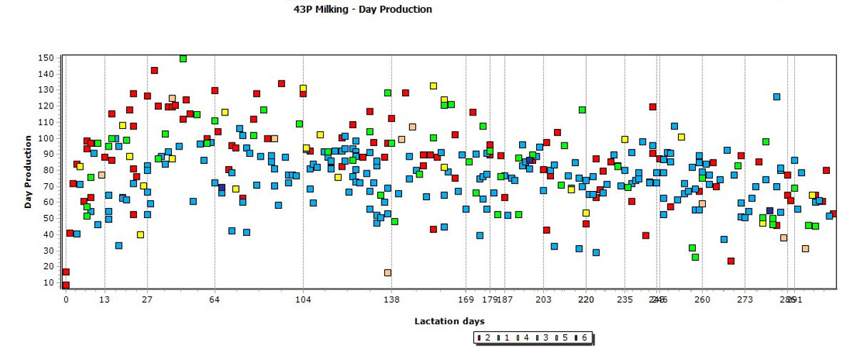
- Do you see a “normal” lactation curve for heifers (looking only at the blue squares)?
- Do you see a normal lactation curve for cows (excluding the blue squares)?
- Where are animals peaking (milk production and days in milk)?
- In the example, most are peaking around 120 lbs. of milk. Do you see that there appears to be a “maximum” of about 130 lbs.? What is limiting production on those high producing cows?
- Look at the blue squares. Do you see a nice increase in milk to about 64 days and then a rapid drop after 64 days? Is this the result of a feed table or milk access change? Did we have an event that stressed heifers that calved at that time?
- What is the slope of an imaginary line from day 0 to peak milk for cows? This is an indication of how well cows are starting lactation.
- What is the slope of the line from day 0 to peak for heifers?
- Use this graph for a big picture look at the herd. Focus on the trends, not the outliers.
Milk Day Production In Time:
This is a graph that provides an overview of the herd going back in time. You can change the amount of time you want to look at to see the last year, the last month, the last week, etc.
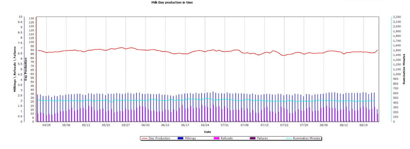
This graph shows us productions, visits, refusals and rumination minutes from April to August and can be customized to show whatever time period you want to see. You can also turn parameters on and off. This herd has been very stable over time. This is a good graph to review on a regular basis.
- How has production changed over time?
- Are visits and refusals consistent or do you see wide swings?
- If you see inconsistency, does the producer know why they occurred?
- Seasonality?
- Repro challenges?
- Feed challenges?
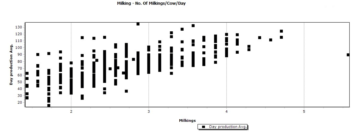
Milking – No Of Milkings/Cow/Day:
This graph give us a snapshot of how many times cows are visiting the robots based on their production. The milk access table will control the number of visits that lower producing animals can have. Those high producers with fewer visits are choosing not to go to the robot more often. Some are simply fresh heifers that have not figured out how to go on their own yet. Others are sore footed cows. Competition around the robots can cause some higher producers to have fewer visits. Look at who these cows are and come up with a strategy to get her going on her own. Visits can also indicate that the PMR has too much energy. Lely suggests that the midpoint of production of the cows visiting twice a day corresponds to the predicted energy content of the PMR. If the PMR energy is “too high” you’ll have more animals visiting two or fewer times per day. If 2.4 visits per day is equivalent to twice a day milking, let’s look at how many animals are not being milked twice a day. What can you do to get another milking for those higher producers that are under 3 visits?
Analyze – Cow Lactation:
This is my favorite graph because it gives me an overview of how the herd is performing. It uses data from all animals currently milking. Look at heifers separately from older animals. The red line is average milk production by lactation day. The green line shows body weight for herds that have scales. The blue bars are the number of milkings and the pink bars are the number of refusals. The red line within the blue bars is the programmed total for feed and the yellow line close to the bottom is the rest feed. Focus on the first 250 days in milk. There are fewer animals included in the latter part of the graph so the data is less reliable.
Use this graph when you are evaluating or building feed tables. The red line tells you what the average production is for heifers and cows in the herd at each day in milk. Make sure that when you ramp animals up on concentrate, they are making enough milk when switching to the production-based table to get (at least) the same amount of concentrate.
You can turn on protein indication and fat indication on this graph also. Fat test can give you an idea whether animals are using excess body fat at freshening and are at risk of ketosis. Remember, this is a look at the whole herd over the lactation so is useful to look for trends but not make decisions about individual cows.
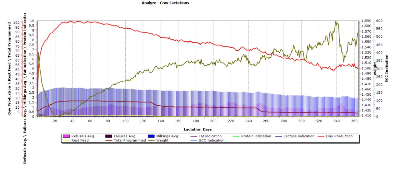
- First look at the milk production line. Does this look like a normal lactation curve for mature cows? What is peak milk and how many days in milk are they when they reach peak? What does the slope after peak look like? Are they persistent or dropping too quickly? In this example, I see a steep increase in production over the first 10 days and then the slope gets more gradual. Is the feed table supporting the higher production or are we restricting animals that need more energy? The curve flattens at about 100 lb of milk rather than coming to a normal peak. I would suggest that there’s milk to be gained by working on the feed table in early lactation.
- Look at the visits and refusals. This one looks normal for mature cows. They freshen into the herd knowing how to use the robots and very quickly achieve 3 visits per day with 1 refusal.
- Compare the milk production line with the total programmed line. We can tell that this feed table has a change at 130 dim and another at 250 dim. These cows do not seem to lose production in response to the feed change, but sometimes there’s an obvious dip in the milk line when feed changes. If you see that dip, talk with your nutritionist about your feeding strategy.
- The body weight curves can be useful in telling you how much weight animals are really losing between freshening and peak milk. The day 0 weights will be after calving. Look at 305-day weights for weight at dry off. The longer days will be cows that were slow to breed back and not representative of the herd.
- If you turn on fat indication, you can see if early fat test is high and perhaps indicative of a ketosis risk.
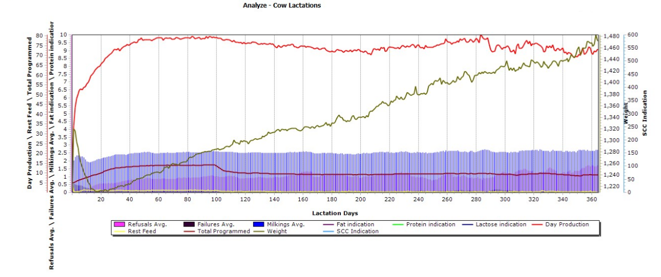
The graph above contains data for first lactation animals.
- Notice that small dip in the milk production line at about 10 dim. What’s happening there? This graph contains data from all animals in lactation so when you see a “dip” it’s usually a feeding or management factor that affects all animals. Dips occur when there’s a poorly programmed feed table change, a pen move, a vaccination, etc. A dip represents lost production, something we want to avoid in a fresh animal.
- The blue bars indicate that this herd is doing a good job training heifers. I like to see heifer with more than 2 visits/day during the training period. You can see that visits drop off when they switch from intensive fetching to allowing the heifer opportunity to go on their own. This herd is slow to get to 1 refusal – 40 days. There may be opportunities to work on heifer training and get more milk.
- Look at what happens to milk production when the feed table changes at 100 dim. How many animals are we taking concentrate away from at that point? I’m ok with taking concentrate away from a low producer at that point, but I don’t want to penalize a fresh animal.
Milking – Visit Behavior:
This is a table that gives you data for each animal. The default report is shown below. I like to copy it and add a few more columns to make it even more useful. If the herd is feeding more than one feed through the robot, you can list total programmed, amount consumed and rest feed for each. I like to have the “total programmed” so I can verify that the animals are allowed the amount that I expect – just a double check to make sure the feed table is performing as expected. I usually add fat indication and protein indication to look at components at different stages of lactation. Temperature can be interesting to look at in the summer as an indication of heat stress and rumination can be useful to monitor for fresh cows or after a ration change. This report just puts the parameters I want to see on an individual cow in a place where I can sort them easily.
This table can be sorted by clicking in the heading of the column you want to sort. It can also be exported into excel for more analysis.
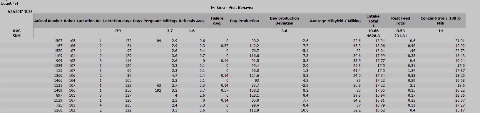
- Sort by lactation days and skim down through the columns. Are animals coming up in milk as expected? How many visits and refusals are they getting? What is early lactation fat test?
- Sort by total programmed and make sure your top and bottom end cows are getting fed what you expect. I once found fresh cows with 0’s (ie: not getting any feed in the robots) because they were manually assigned to fixed feeding at the end of the last lactation which took priority over the feed table when they freshened back in. I’ve also found herds that were feeding a lot more than the producer thought and some that were severely restricting high producers. It’s important that you and your nutritionist understand how the feed table works and skimming down a list of cows sorted by production can help you see how it’s working.
- Sort on day production. How much are the highest cows making and does your ration support them? Who are the low producers and, if not fresh animals, should they be dried off or culled?
- Sort by refusals. Is your refusal number high because there are a couple animals going through 20+ times a day and skewing the number or because the whole herd is looking for energy?
- Sort on rest feed to see which animals have high rest feed. Lely robots dispense feed when the cow is in the box regardless of whether her head is down to eat so a cow with high rest feed is one that is not visiting well either. In a Delaval system, it only dispenses when her head is down, so we can see high rest feed in cows with normal visits if they don’t put their heads down when they are in the box.
If you’ve got some extra time in your day while your service people are sheltering in place, review these reports and make a list of questions for your nutritionist when he or she is back on the farm. With your permission and Teamviewer login information, we can review the data remotely and we’ve got some extra computer time right now. Together, we might find some areas where a little adjustment can make a difference. Stay safe and thank you for keeping the cows fed and milk flowing!